Eternal Crusade: Resurrection - PC
These are the concept screens for a fan project to bring back Behaviour Entertainment’s Warhammer 40,000: Eternal Crusade. Art used created by the Warhammer Community all rights belong to their respective owners.

Figma, Unreal Engine 5, Sourcetree
Role: UX/UI Designer
Stakeholders: Lead Programmer, Lead Designer
Involvement: All menu screens, style guide, logo.
The Brief
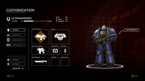
For this project I was tasked with creating the menu screens for the main menu, multiplayer matchmaking, respawn screens, and map images. Because this is a fan remake of a previously existing title there were some elements that we wanted to be consistent with the original so that returning players still recognized the game. The UI layouts that I wanted to keep familiar were the character customization screen and respawn screens. The game is also live so that previous designs just needed a visual overhaul in addition there were some current user design issues that needed to be addressed so I was both redesigning screens and addressing some UX issues that were user facing.
The Process
I first started with creating a style guide that would help act as a guideline going forward with the design for each of the screens. I used Figma to redesign the screens, I would use the prototype function to briefly demonstrate how the screen should be interacted with and whether or not it was within the scope with our programmer. When the screens were ready I would export them as PNGs to be used as texture assets. I was able to setup the base look and feel in Unreal Engine 5 before handing it off via the team Git repository.

Revamping Old Screens
I was given older screens and told to revise the screens into one that would fit the theme for Warhammer 40,000. Luckily this meant that I had free rein on the design with the only constraints being: the established functionality and the knowledge of our lead programmer. Given that players are already familiar with the user flows some of the interactions were kept somewhat familiar to match the users' current expectations and reduce cognitive load.
The Initial Login Panel:

The Updated Login Panel:

Screens were initially created as wireframes before fully adding the other elements.


Addressing User Experience Issues
During a match, players earning XP points would be able to use their them to respawn as veterans. However the ability to spawn as veteran units is not communicated, especially for the losing team that will get additional XP points to spend to even the playing field.
Initial Respawn Screen

-
Does not communicate that veterans are available
-
It's not explicit what the XP points are used for
-
Veterans are hidden from the scrollbar
Proposed Solution
-
Create an association between the XP and how it is used by showing the XP cost to spawn the veteran unit
-
Veteran units unlock as they become available to spawn
-
Using two columns: one for normal infantry and one for veterans to ensure visually acknowledged that Veterans exist and can become available

Redesigning Character System to Increase Matchmaking
The Problem:
In the original title, the number of matches was reduced due to character creation. Creating characters allowed for progression and to create a truly unique character was definitely a high priority for the community. However, this reduces the number of games occurring concurrently as some matches were set between 2 of the 4 factions available. Locking out players of another 2 factions from playing.
The Solution
Allow players to play all factions and keep the customization elements. Players will be able to select their favorite faction for all races allowing them to join any match in addition they can customize their characters for each specific faction. Similar to Chivalry where each class is given their own customization between the 2 factions.


Scaling Screen Resolutions
Unreal UMG UI Design
I used this opportunity to familiarize myself with using Unreal Engine 5. I was able to create the UI layout using grid panels to place the elements. I also had to take into consideration the fast amount of screen resolutions. I used a Scale Box to encapsulate the all the elements on the screen. This would ensure that at the very least the screen could scale. Though this would mean


Launcher Play Button States
Simple button states to show when the game is ready to be launched. Hover state to provide feedback before being clicked.
Mission Type States
Button states for selecting missions during match creation. The images were picked to denote the theme of the mission. They were also positioned so that the characters point towards the text to lead the eyes to the mission text.

Technical Challenges
The greatest challenge was having to learn how to utilize Unreal Engine 5 to implement the UI. Besides the technical issues our team was working across different timezones, making communication vital to keeping the project moving. Leaving notes on Figma designs, outlining what needs to be worked on kept the team productive.


